List View Contents
The List View displays an organized view of your current process model: element, steps, layers, sequence order, and so forth. List View can display this information in several different nested tree displays. Where higher level information is shown as the top of the tree and you can expand each section to get more detailed information; right down to the actual geometric elements.
For example, the process model organized by Layer and Step:
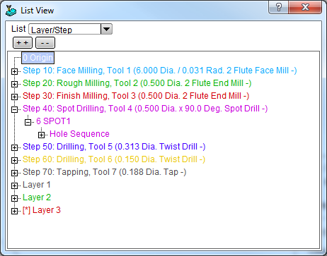
The List View also supports a Context list. This is a flat list - not in a tree format. It simply lists the element geometry in sequence order. This list type is different, in that the contents of the list will vary depending upon what the active input token is expecting. If the active input field is expecting a Step number the list view changes to show all defined steps, if expecting a layer - the list changes to show all defined layers.
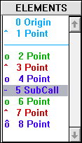
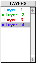
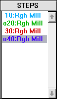
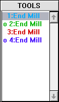
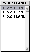
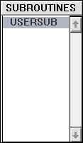
The heading, just above the selectable list of items, shows what type of information the list view contains. Here is an example of all the list view types:
|
|
|
|
|
|
List View Window
In the SmartCAM workplace, the default location for the list view is along the right-hand side of the main application window. The list view can be docked against either the left- or right-hand side of the application window. The list view can also be used as a separate floating window.
To make the list view a floating window, right-click on the list view's title bar and select "Float" from the pop-up menu. To dock the list view, select "Dock" from the pop-up menu.
When docked the list view is positioned on the same side of the application window as the control panels. You can control which side is used, with the Utility - Options function. Set the Category to Presentation Options; the property to modify is Panel Position. Keep in mind this also controls the where the control panels are displayed. When the list view is floating, you can resize it as needed. When docked you can use the Utility - Options - Presentation Options property Sidebar Width to specify the width of the list view.
Drag and Drop
Using drag and drop, within the list view, you can move and set the insert position; as well as resequencing geometry, steps, and layers.
To set the insert position, find the current insert position marker (the horizontal line), click and drag the insert location up and down the list.
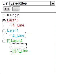
In this example, the insert location is being moved from just prior to element 3 to before element 2.
When using drag and drop, the location of the "drop" is marked by an insert marker. This is a line with two arrow lines on either end.

You can drag and move any item or groups of items, by clicking on the highest encompassing branch in one of the List View tree views. So, to move an entire Layer, go to the highest level and drag and drop "Layer 1" at the highest level in the tree to move everything under that Layer 1 branch. You can expand the branch and click on a solid, or profile, or drill down and move a single element.
Colors
The List View and Graphics View are closely related; the list view is a list version of the same information displayed in the graphics view. Or, inversely, the graphics view is a graphical representation of the items listed in the list view.
The color of items in the list view matches the color of the same items in the graphics view. This even includes the background color. In the above examples, element 1 is shown with a light blue text color. The point drawn in the graphics view is also light blue. This applies to Layers and Steps as well. Items drawn with Layer 2 would be drawn with a green color and items created using Step 30 would be drawn in red.
Insert Position
In the Elements list view, there is a thin blue line after element 1. This is the current insert position. Depending upon whether you set Insert Before or Insert After on the Insert Properties bar, newly added geometry will be added before or after this insert position marker.
The list view right mouse button menu includes an option, Go To Insert, which will update the list view contents to display the insert position. Any collapsed tree branches, related to the insert position, will be expanded.
Selected Entry
The colored bar across Element 5, Layer 4, Step 40, etc is the selected element marker. It shows what is the current selected item in the list.
The selected entry can be set by right-clicking on an entry in the list view. If right-clicking
does not work, try using your middle-mouse button. This is user configurable, see the Automation/Customization -
Customizing SmartCAM - SmartCAM INI Overview - The
SmartCAMcnc.INI File - SwapMidRightMouse topic, in the [Defaults] section, for more information.
Clicking on an entry this way selects the entry. In the Elements List View, it also opens a pop-up menu with several element related options. From this menu, you can display Element Data for this element, modify the element, name the element, and delete the element. You can also mask or unmask the layer or step that the element is based on.
Right Mouse Button Menus
Right clicking on an element, layer, step, tool, or workplane will display a pop-up menu. This menu contains features that are commonly used with the selected entity type (for example, Modify for an Element) or features that are often used.
See the List View Pop-up Menu topic.
Special Symbols
There are special characters or symbols that could be displayed next to the entries in the list view. These symbols have special meaning and give you additional information about the entry. These symbols are:
| Symbol | Name | Meaning |
|---|---|---|
| - | hyphen | This element is part of the active group. With the Group Arrow active, elements you pick are added to the active group, they are marked with a hyphen. |
| > | greater-than | This element is the current insert position. In the tree-based List View displays, the Insert Position marker will be displayed on the insert position element and all its parents. |
| ^ | carat | This element is hidden. The element is marked as hidden, depending upon your View Filters options, the element may or may not be displayed in the List View. |
| o | lowercase o | The item is masked. You can mask by z-level, layer, step, or tool. The tool,
steps, and layers list views show the masked entries. Elements cannot be individually
masked, however if they are on a masked layer, step, or tool they will be shown as
masked. Or, if a Z level range is used, they will be shown as masked.
Depending upon your View Filters settings, masked items may or may not appear in the List and Graphic views. |
| ô | o with ^ | The item is both masked and hidden. |
| R | capital R | Shown in the workplane view, when the workplane is reserved. |
| ~ | tilde | Shown in the workplane view, when the workplane is wrapped. |
| D | capital D | Shown in the workplane view, when the wrapped plane is about to be unwrapped. |
| S | capital S | Shown in the workplane view, when the workplane is assigned to a subspindle. |
The symbols can be changed using Utility - Options - Presentation Options.